Genre- pop music video.
- codes and conventions- dance routine, lip sync, sterotypes,
Narrative- daydream- represented by blur. We can tell that its a daydream by the way in which it ends where it began, back in the classroom with DIAGETIC SOUND.
Representaion- stereotypical ideology of a teenage girl. She wears the same (mise en scene) yet stands out.
ANDREW GOODWIN'S MUSIC VIDEO THEORY.
- should be a 'star' as centre stage
- extreme close ups freaquently to provide audience with a sense of VOYERISM (comfort in being able to look at people close up out of curiosity without feeling guilt)
- the visuals will relate to the song
- narrative to the video. a beggining middle and end.
- thought beats, seeing the sound in our head.
Friday, 18 March 2011
Friday, 4 February 2011
continuing to film
I think overall our filming was very successful. After shooting the scene of the girl being sick, we moved onto the shot of the man walking in front of a green screen for Daniels production. This was very effective as we managed to get an actor who was perfect for the part of a drunken dad
Tuesday, 25 January 2011
First stage of filming.
We decided to go and shoot the scene of the drunken girl being sick in the toilet. This scene was suitble to film during lessons as the settting was a bathroom, and was possible to use the college toilets. The only prop that we had to collect was lentil soup for the sick. We shot the scene from her point of view, the camera looking down as if she was holding onto the toilet and seeing the sick fall into it. We put the girls hands onto the side of the toilet, and hair was falling down around the camea. Soup was then poured into the toilet mimicking her being sick, and we made the sound effects of sickness.
We soon found that this was not the easiest of scenes to shoot. Being in a school toilet cubicle it became very crowded. It was necassery to have three people at least within the cubicle. One to hold the camera (Daniel), one to act as the hands and occupy the shot (myself) one to act the noises (catherine) and one to pour the soup (megan). We had to be very organised and timed within the shot, and a huge amount of teamwork and discussion had to take place. We had to simultainiously pour the soup whilst making the noices, and ensure that the soup tin didnt come into the shot. It took us various takes and attempts to get the perfect shot.
In the end it was sucessful, however we did have to sacrafice some things that were planned originally. For example our main problem was positioning the camera in the correct place and enabling megans hair to fall over the sides of the camera. We soon found however that this was a problem as the camera was to big to fit between megan and the toilet as if the camera was her eyes. If the camera was positioned in front of megans face, we couldnt see the hands on the side of the toilet which were the things that made it really seem as if we were seeing it through the girls eyes. We had to play around with the shot, realising that the only possible way was to pysically move the camera to the right of megans face so we could pull the camera out and see her hands. However this was at the sacrafice of her hair dangling around the camera which would have added even more realisim to the cameras point of view from the girls eyes. Therefore we had a minor shot change.
We were also unsucessful in the fact that in some of the shots taken the tin of soup would appear in the corner of the shot, giving away to the audience that it was in fact soup, not sick. However it will be possible to hide this mistake in the editing process.
To conclude looking back at the footage we shot we were very sucessful. Although we had to sacrafice not having megans hair in the shot, we still fulfilled the main aim of ensuring that the camera was in the place of megans eyes and from her point of view.
Thursday, 20 January 2011
Creating the poster.
When creating the poster to go with my anti drinking campaign i realised that after researching them, the simpler the poster, the better. It was extremley common for the poster to have striking white writing on top of a dark, dramatic picture.
This poster is visually effective. The questionmarks relate directly to the target audience. The white bold writing is also extremley eye catching as it contrasts with the background, attracting the eye. The fact that the poster shows alcohol enables the poster to be quick at sending the message across that it is about alchol abuse. The audience dosent need to figure out the message of the poster, it is visually clear. For this reason the poster is effective.
This poster is visually effective. The questionmarks relate directly to the target audience. The white bold writing is also extremley eye catching as it contrasts with the background, attracting the eye. The fact that the poster shows alcohol enables the poster to be quick at sending the message across that it is about alchol abuse. The audience dosent need to figure out the message of the poster, it is visually clear. For this reason the poster is effective.

This poster below also has bold white writing over a dramatic picture. This seems to be a typical code of anti drinking posters. The message is quick and straight to the point, no messing around. "u booze" "u looze" is simple and effective. The way in which the "u" is used is directly aimed at yound adults and teenagers, the target audience. This is supported by the young male character featured in the poster. When asking people what they thought of this poster they explained to me that the posters message was simple and effective. They knew that the poster was sending the massage across that drinking can cause disruption in life.This made me realise that when i create my poster, it would be a good idea to keep mine simple and straight to the point. With a fairly young target audience it seems as if a simple message that is fast to bring across is alot more effective than having to be analytical to find out the message.


When producing my own poster for my anti drinking campaign I used the typical code and convention that all of the other anti drinking posters that I observed, using bold writing in a simple font on top of a dark, dramatic picture. Becuase of my storyboard all being based around the message that drinking causes vulnerablility i decided that a picture of a young girl (the main target audience of my campaign) would be best to use. It is clear from the photograph in the poster that the girl is vulnerable and has clearly drunk too much. The bottle of cider emphasizes the message and is stereotypical to see a girl in a state with a cider bottle laying next to her. The message is then emphasized by the bold title of "vulnerability is caused by drinking" then "dont put yourself in that position" in crimson writing with an impacting font. The message is clear and straight to the point, similar to the posters that I observed in my research. The logo at the bottom (ECMD ADVERTISING) adds professionalism and realism to my poster. By having a company name visible, but undestracting of the main message, it makes the target audience think more seriously about the message that the poster is conveying. Overall my posters message is simple, and it attracts the target audience of young teenage girls of whom are likely to drink and reminds them of the vulnerability that they can put themselves in when drinking excessive amounts.
Wednesday, 19 January 2011
Coming up with ideas and considering feedback about our two chosen ideas.
Firstly we decided as a group that we would focus on the awareness of the consequences of drinking. Although an already researched and publicized topic we believed that there was still room for originality and creativity to create a brand new, successful public service broadcast. We knew after researching the topic of the consequences of drinking, many of the adverts, as predicted were aimed at teenager and young adults.
http://www.youtube.com/watch?v=yWCUekDn7cw
This advert is aimed at young adults and teenagers- the age in which the majority of binge drinking takes place. I realised that this advert especially focused on the vulnerability and embarrassment that over drinking can cause. This successfully made me as an audience think twice about the possible consequences about over drinking. When asking my peers about what they thought about this advert they agreed that it was successful and really made them think about the vulnerable positions that drinking can put them in and the lack of control in which they have.
Other adverts I found aimed at teenagers that seemed to affect people emotionally when I asked their opinion of it was the adverts showing the emotional or physical consequences of drinking. http://www.youtube.com/watch?v=FfY7L_QUk8o&feature=related
I found that this advert was successful when asking people to view it. I found that by hitting their emotions really made a long term impact on them. Adverts that seemed to try and use comedy to bring across the message was less successful. The powerful image of the woman in tears at the end really tugs on the heart strings.
http://www.youtube.com/watch?v=OxBcj92ze8M&feature=related
This advert personally for me was extremely effective. The way in which he seems like a normal youngster from the back, an average child playing around with a basketball is the perfect stereotype of a youngster. However when the camera pans round to see his face it is truly shocking as we see that in fact he has aged a great deal, we realise later from the consequences of drinking. This opposes the stereotype of what we expect to be a youthful face. This is why it is so effective, it shocks the target audience of teenagers. They don't want to appeal abnormal. When showing this advertisement to my peers there were many comments about how disturbing it was and how disgusting he looked. This is why the advert is successful. It grabs the attention of teenagers and shocks them. They don't want an aged face, it would be abnormal and abnormality and appearance is a very sensitive topic around teenagers.
From this advert my idea became clear. I had realised from my research of asking people of our target audience what they thought of these adverts that the most effective ones were the ones that dealt with the emotional and physical consequences of drinking, especially if they resulted in abnormality. For this reason i decided to focus my idea on the emotional and physical consequences of drinking. I thought that the advertisement when you see the face at the end was also extremely effective, which is where the idea of seeing the girls distraught and upset face last came from. I also like the vulnerability and this is the main message that I wanted to bring across in my P.SB, which is why i included the possibility of a male taking advantage of a girl whilst she is drunk. Although this would mainly be aimed at women anti drinking, it would be very effective.
When presenting our ideas to the class, there was fairly positive feedback. We decided to choose mine and Daniels idea. This was because we agreed that these ideas had the most originality, with the most potential. The other ideas that were shared also could have been successful. For this reason I took some of their ideas and incorporated them into my own, such as the blurred vision and hand held camera and the alleyway scene. This way it would make our two chosen public service broadcasts substantially stronger.
The feedback we as said before was overly positive. They said that the ideas were original and contained a clear message about the seriousness of the consequences of drinking. However to improve we could ensure that the anti drinking message would be a lot clearer in the actual production. For Daniels advert for example instead of a man walking and drunkenly stumbling, he would be holding a beer and there would be a clearer voice over at the end of the message.
Tuesday, 11 January 2011
Analysis of anti smoking public service announcement and other Public service broadcasts.
Criticial theories and how they relate to Public Service Broadcasts-
Uses and Gratifications theory.
http://en.wikipedia.org/wiki/Uses_and_gratifications_theory
This theory focuses on why people consume media. It states that the audience seek the media, the media does not seek them. It suggests that people activley consume media to gratify thier need of being entertained and or informed. For example the media is a fantastic way of informing us on recent stories which are often topics of social conversations. A person would be far more confident if they had been informed on the latest 'celeb breakup' as they would then be the one in the social circle who knows the 'latest news' or 'gossip'.
When applying this to public service broadcasts people feel much more secure when they are informed about controversial topics, such as domestic violence, or sexually transimitted diseases for example. In the social world people are seen as 'stupid' if they dont know about sexually transmitted diseases.
http://www.youtube.com/watch?v=m62H9yu48eU
This advert would gratify the target audiences (young adults and teenagers) need of being informed about sexually transmitted diseases. They seek to be informed about this conteroversial topic to seem knowledgeable in front of their friends. They would seem to be the 'popular' and 'cool' one (an important thing they want to be around this age) if they knew the facts about this topic. They would probably seek to know things about this to[ic if they needed to know about these things for personal reasons or experiences that they may have had in thier lives to do with sexually transimitted diseases.
The Audience positioning theory;
dominated
negotiated
DETATILED TEXUTAL ANALYSIS OF ANTI SMOKNG PUBLIC SERVICE BROADCAST-
http://www.youtube.com/watch?v=ucszwf7JJG8&feature=related
This advert is hugley effectitive and is targeted right at the hearts of the target audience of middle aged parents whom are likely to have children of the ages featured on the advert.
It beggins with a series of clips of young children looking cute, cheeky and youthful. They are shown playing 'builders' and other various games. It tugs at the heart strings of parents as they can empathise with the advert, having children themselves. They are shown how perfect, healthy and lively children are at this age. The atmosphere at the beggining of the advert is emphasized with the non diagetic sound of the music. This music "twinkle twinkle" is typical of young children and reminds us of them pattering around the home being kids. This represents children as sweet, cute and delicate.
However in the middle part of the narrative, the atmosphere of the advert changes. We see a little baby with smoke coming out of its mouth, as if a smokers would. However this is done in a subtle way, nothing else changes in the advert apart from this. This makes the audience feel unsure and perquiliar as the adverts suggesting that this is normal of children. The advertisement then continues with a series of clips similar to this, still portraying children in a cute, giggly innocent way. This makes mothers especially feel unsure and insecure about watching this advert as it is their maternal instinct to protect and keep their children healthy.
The voice over then interjects and the end of the narrative. Once again this dosent change the atmosphere as a motherly voice softly beggins to say "if you smoke, your children will begin to smoke too". The fact that this is a 'mothers' voice it targets the main audience of mothers sucessfully. It then goes onto give a fact, which really turns the opinions of the audience and ensures it effects them. "every year children are addmitted to hospital from breathing in other peoples cigarette smoke". This shocks the audience as it emphasises their responsibility over their children.
Tuesday, 30 November 2010
Considering the creation of my mens political magazine.
After searching for a suitable photo of David Cameron, the best one I found was suitable because it is a clear photograph, with excellent lighting and background. His pose is casual and he is directly looking at the camera, as if on a photo shoot. This makes the magazine seem professional and worth your money.
Next i had to decide upon a name for my magazine. I wanted the name to relate to the topic of my magazine- politics, whilst being catchy and professional. After some thinking i came up with the name CONSERVATIVE. I thought this name would be most successful as it directly relates to my demographic of middle aged business men of the middle/upper classes as they are most likely to support the conservatives as they tend to be more popular with these classes. In conjunction with the background my magazine will be aimed at a very specific demographic, however it will be hugely appealing to them, ensuring high popularity with the magazine. I made sure that the CONSERVATIVE title was bold, and contrasted with the background, which is why i choose white. This ensured it was appealing, manly and eye catching.
After deciding on the name and background i moved onto the decision making of what articles i would like to include. I began looking around for other magazines with similar demographics for the articles in which they featured.


I found that mens health in particular focused on the male image a lot, and the way that men are 'supposed to look', for example "16 flat-belly foods", "six-pack abs!" and "stronger arms". Men's health demographic is middle aged men that care about their appearance and the effect they have on the opposite sex. I thought that as my magazine was aimed at middle aged men also, just with the difference of them being educated business men, my magazines should have an article with consideration of how men want to look, as they are likely to have wives at home in which they want to impress. I decided to add an article "20 flat-abs foods", similar to the one on men's health.
I also wanted to include many features that relate to a business lifestyle, as the magazine is aimed at men in businesses so therefore should be obvious on the front cover as so to attract the correct demographic. For this reason I have included many things such as "top business phones for you" (relating to the demographic of businessmen, whilst bringing across the theme of modern technology which middle aged and older men will be interested to find out about). I also included an article featuring a direct quote from inside the magazine (a convention of magazines) saying "Cameron's next pledge: "I fight to make the rich, richer"". This thoroughly appeals to men of this demographic, as David Cameron is likely to be an inspiration to them, as he has made it to the top of his career and he is the one that holds the power to affect THEIR lives.
Below this i featured an article saying "economist James Healy gives the update on the current economic climate and tells YOU how to survive". The "you" stands out in bold, red capitals which enables it to be a very powerful word as it enables the magazine to talk directly to the audience. It also catches their interest, as they are likely to have investments in businesses or savings and are bound to want to know weather interest prices or economic prices in general are high or low. This tells them that this will be very valuable information for them to know.
Below this it says "INSIDE- 10 tips to get you to the top of the property ladder" this would greatly interest these high earning men, as they are likely to be very materialistic and wanting to be setting up their comforts for their future retirements. They would be very interested by tips on how to get to the top.
The real life stories article creates verisimilitude for the audience. The fact that the real life stories are based on things that could easily happen to them, such as debt creates huge interest for them as they can understand and empathise with the stories. The audience are likely to have common problems such as debt so these stories are very successful at making the audience pay attention to it.
The article focusing on Richard Branson is an inspiring article. It tells the audience that men like them CAN become hugely successful, if they follow in the footsteps of Richard Branson, this in turn then persuades them to read the magazine.
To conclude i think my magazine looks fairly visually appealing and i have included a wide range of articles, which enables each article to really appeal to individuals within the demographic.
Next i had to decide upon a name for my magazine. I wanted the name to relate to the topic of my magazine- politics, whilst being catchy and professional. After some thinking i came up with the name CONSERVATIVE. I thought this name would be most successful as it directly relates to my demographic of middle aged business men of the middle/upper classes as they are most likely to support the conservatives as they tend to be more popular with these classes. In conjunction with the background my magazine will be aimed at a very specific demographic, however it will be hugely appealing to them, ensuring high popularity with the magazine. I made sure that the CONSERVATIVE title was bold, and contrasted with the background, which is why i choose white. This ensured it was appealing, manly and eye catching.
After deciding on the name and background i moved onto the decision making of what articles i would like to include. I began looking around for other magazines with similar demographics for the articles in which they featured.

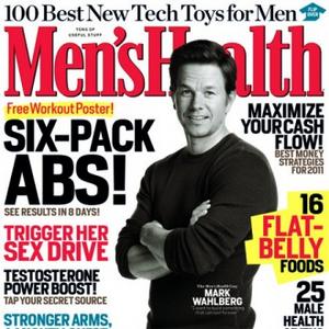
I found that mens health in particular focused on the male image a lot, and the way that men are 'supposed to look', for example "16 flat-belly foods", "six-pack abs!" and "stronger arms". Men's health demographic is middle aged men that care about their appearance and the effect they have on the opposite sex. I thought that as my magazine was aimed at middle aged men also, just with the difference of them being educated business men, my magazines should have an article with consideration of how men want to look, as they are likely to have wives at home in which they want to impress. I decided to add an article "20 flat-abs foods", similar to the one on men's health.
I also wanted to include many features that relate to a business lifestyle, as the magazine is aimed at men in businesses so therefore should be obvious on the front cover as so to attract the correct demographic. For this reason I have included many things such as "top business phones for you" (relating to the demographic of businessmen, whilst bringing across the theme of modern technology which middle aged and older men will be interested to find out about). I also included an article featuring a direct quote from inside the magazine (a convention of magazines) saying "Cameron's next pledge: "I fight to make the rich, richer"". This thoroughly appeals to men of this demographic, as David Cameron is likely to be an inspiration to them, as he has made it to the top of his career and he is the one that holds the power to affect THEIR lives.
Below this i featured an article saying "economist James Healy gives the update on the current economic climate and tells YOU how to survive". The "you" stands out in bold, red capitals which enables it to be a very powerful word as it enables the magazine to talk directly to the audience. It also catches their interest, as they are likely to have investments in businesses or savings and are bound to want to know weather interest prices or economic prices in general are high or low. This tells them that this will be very valuable information for them to know.
Below this it says "INSIDE- 10 tips to get you to the top of the property ladder" this would greatly interest these high earning men, as they are likely to be very materialistic and wanting to be setting up their comforts for their future retirements. They would be very interested by tips on how to get to the top.
The real life stories article creates verisimilitude for the audience. The fact that the real life stories are based on things that could easily happen to them, such as debt creates huge interest for them as they can understand and empathise with the stories. The audience are likely to have common problems such as debt so these stories are very successful at making the audience pay attention to it.
The article focusing on Richard Branson is an inspiring article. It tells the audience that men like them CAN become hugely successful, if they follow in the footsteps of Richard Branson, this in turn then persuades them to read the magazine.
To conclude i think my magazine looks fairly visually appealing and i have included a wide range of articles, which enables each article to really appeal to individuals within the demographic.
Subscribe to:
Comments (Atom)